A New Look for The Book

As of today, The Dressmaker’s Companion has a new look!
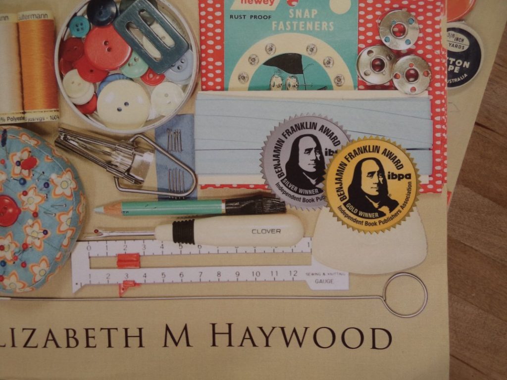
The cover now displays the seals from the Benjamin Franklin Awards, with an addition to the back blurb as well.
There are a couple of changes inside the book too, which will make the book (hopefully) easier to read and use.
The Dressmaker’s Companion is my first book, and while I did a lot right with it, I felt there was room for improvement in the format. My husband asked if I would ever be finished with it!
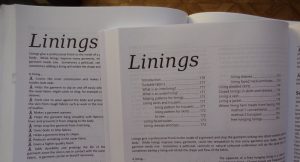
The biggest change is that each chapter now has its own chapter contents, so the contents can be viewed at a glance.
The other noticeable change is a top border to separate the text from the page header, making it easier to flip through and find subjects. The header and page numbers are also bigger. A few readers suggested this after reading the first edition, and they were absolutely correct!
There are some other minor changes: the zip illustrations have been made slightly larger, there’s a little more “air” in the format, and a few formatting inconsistencies have been fixed. The contents page has dotty lines to read across better.
The new version is available from today onwards. Many thanks to all who bought an original first edition!
Cheers!


Just purchased the new edition from Amazon AU and looking to getting it in the next couple of days. 🙂
Cheers, Ron!