3 Random Tips for Colour Choices
Are you confident with colour? I think I am these days, but I never used to be. Over time I picked up ideas from people I worked with, and also my dad who was good with colours. I really started to enjoy colour to the point where I now feel free to offer my opinions, asked for or not!
Here are three tips for choosing colours which I’ve found helpful. These aren’t typical colour wheel theory-type rules, just some things l like to do.
1. Colour or texture
If you’re mixing fabrics in the same garment, match the colour or the texture.
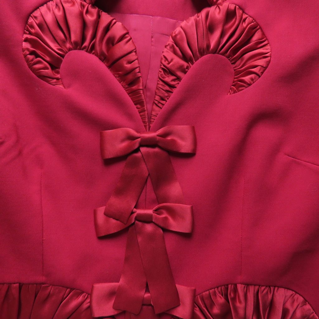
For example, the photo below is a red jacket in pure wool trimmed with perfectly matching silk satin. The matt wool contrasts with the shine of the silk.
A monochromatic outfit in a variety of textures can have a lot of wow factor, and it makes the same colour much more interesting.
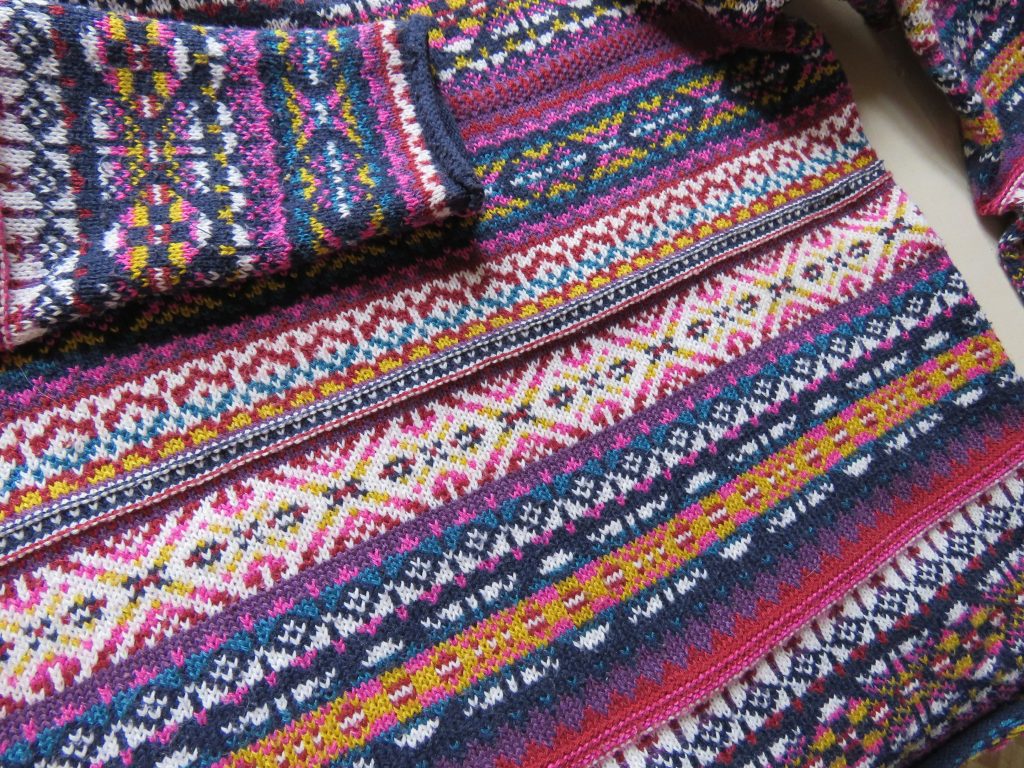
In the next example, we have the opposite: same texture and multiple colours. It’s a fast-fashion jumper from the op shop. As all the colours already share the same texture (being the same yarn type) full attention can be paid to the colour palette.
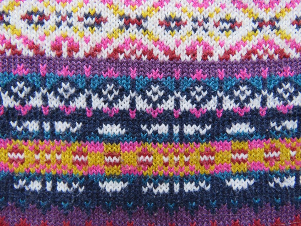
If your fabric choices aren’t working but you aren’t sure why, it might come down to colour vs texture.
2. Look to nature
Some advice from fashion student days: look to nature for colour inspiration. The infinite colours in nature always combine harmoniously, never clashing. If you do dyeing with natural dyestuffs, you’ll notice that the colours produced will always go with each other, even as they fade, whereas synthetic dyes don’t.
This advice really opened my eyes to colour possibilities.
Roses grow in dirt my dad would say, as he walked around in a red jumper and brown trousers, looking smart. Another time, he combined his orange jumper (which I now own), a light blue shirt and khaki-ish work trousers, saying Well, I thought: the blue sky, red earth and eucalypt leaves when I noticed his outfit.
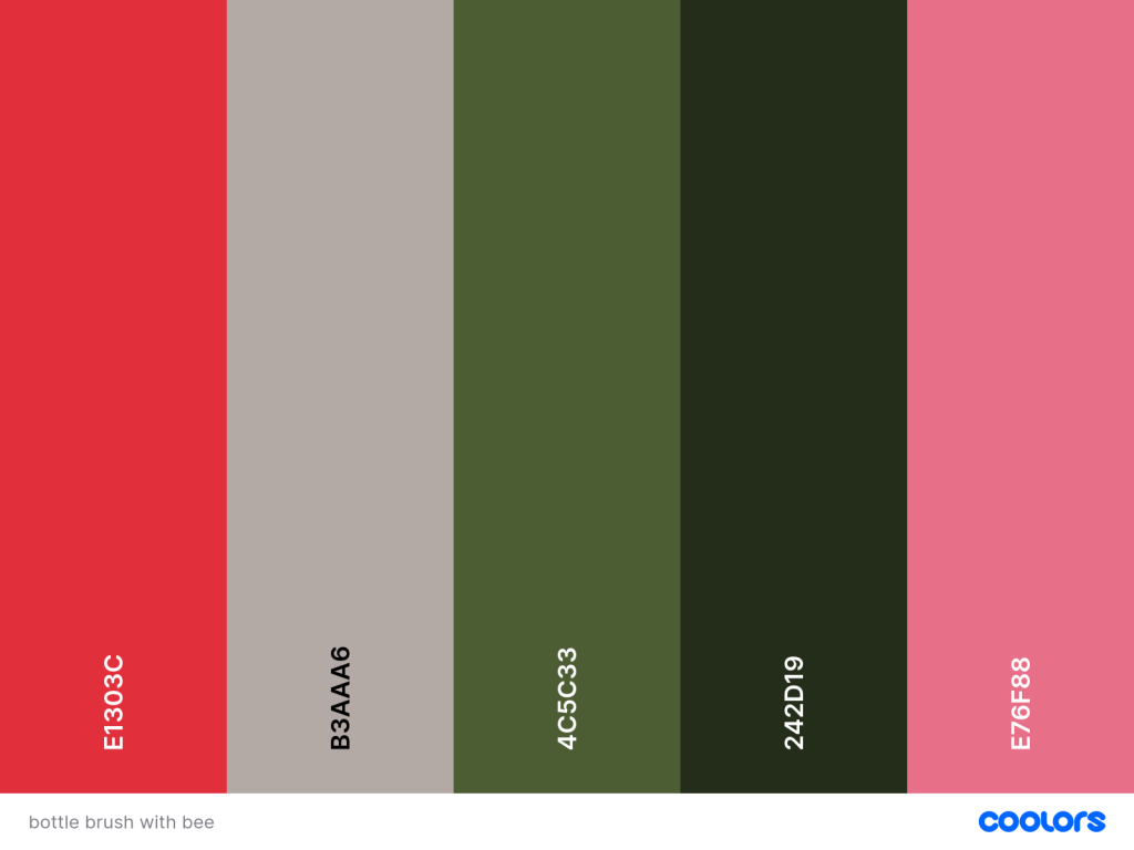
A fun way to analyze colours from nature is to take a photo and put it in a colour palette generator.
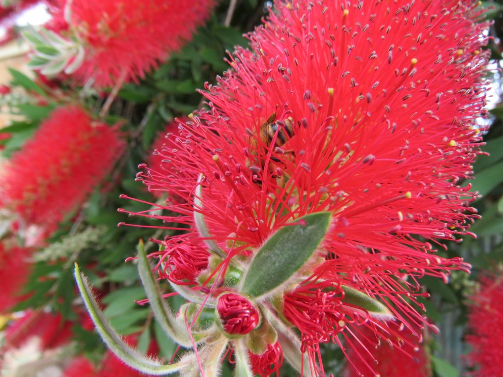
Below is a photo I took this morning, of a bottlebrush in full flower. I uploaded it to Coolors.co which pulled a palette from the image. It’s free to use.
3. Collect compliments
In the absence of “getting your colours done”, how do you know if a colour suits you? Comments from other people give clues: That’s a really great colour on you! Hopefully you socialize in a culture of giving compliments. I find that artist friends are very good at noticing colours.
As a young fashion student, I wasn’t very confident with wearing colour and tended to wear a lot of black, because it was easy. At my first job, post-college, we were making shirt samples in an exciting new fabric: micro peach. No-one had seen anything like it before; it was drapey, ultra-soft and machine washable. Anyway, the samples didn’t turn out right, and were distributed amongst the staff. Being the youngest, I got last pick and ended up with a hot pink shirt. I thought it would clash with the bright orange hair I had at the time, but every time I wore it someone would comment favourably on the colour. From this lesson and other clothes, I discovered the best colours to wear.
Just for the record:
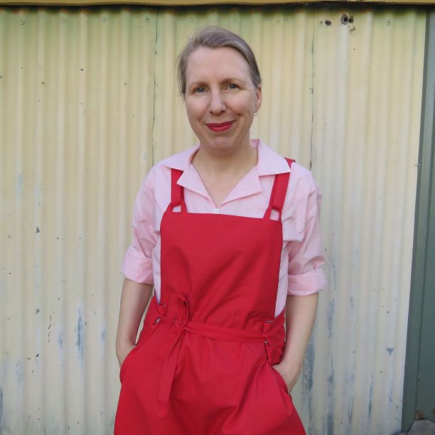
1. Dusty/baby pink
2. Medium blue
3. Red
4. Hot pink
5. Lavender/bluish variations of dusty/baby pink
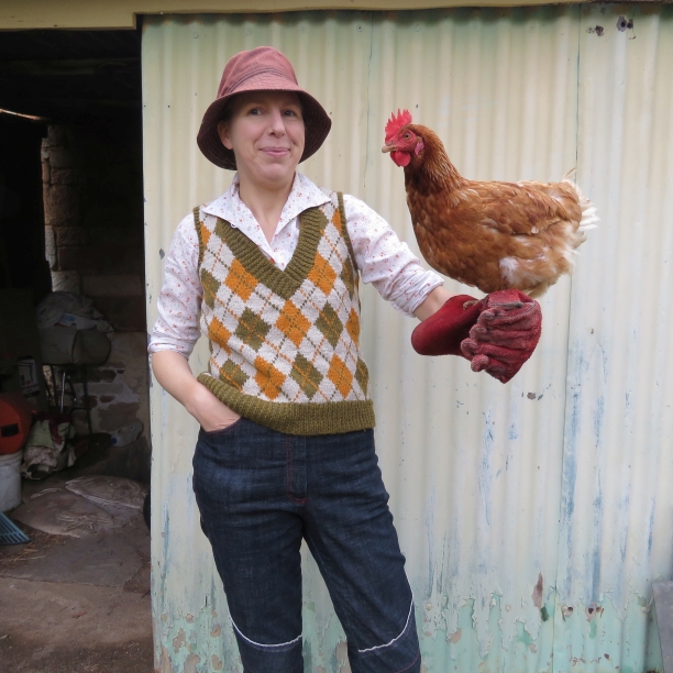
1. Beige
2. Yellow
3. Tan
4. Most dark browns except rich tones
5. White, cream and any Richie Benaud* colours
6. Black, probably
Interesting: some of these colours look passable when worn with a full face of makeup.
Got any colour tips to share? Please feel free to leave a comment.
Cheers! Liz
*For readers in non-cricket playing countries, commentator Richie Benaud wore sports jackets in a neutral palette of cream, bone, white, off-white, ivory or beige, with the most famous being beige.
Hi Liz, Thank you for the terrific thought-provoking post. I was just discussing this with the hubs last night while looking for my „Ultimate 3-1 Color tool“ from Joen Wolfrom, wich was recommend to me as a colour combo tool used by quilters. Because the problem is scraps. Lots of scraps. Now it‘s nice that Dolly Parton was able to turn her experiences being jeered at school for wearing a scrap coat into art (and profit) but when I try to combine my scraps…I achieve the „ unhappily molting parrot“ look. What to do? Using scraps for accents of colours and the rest…Throw out or donate? We have very limited space an donating is actually quite difficult! The stuff needs to be sorted and it often ends up as waste too. Heavy sigh.
Thanks Juliana 🙂 Combining scraps can be really difficult. I’m no expert, but the Check Your Thread podcast has a bunch of talks on using scraps https://checkyourthread.com/tag/fabric-scraps/
Thanks for the article and thanks for the podcast, I didn’t know it 🙂
I love colors and I agree with your ideas, I already use all three. And the love at first sight for a color in a shop.
Cheers Liseli, fellow colour-lover!
priganart aka Sharon Prigan only works with scraps and pre-used fabrics. She sorts them into seasonal colour groups. I love her combinations! She uses up every tiny piece, down to making beads out of the smallest. Worth a look.
Thank you Liz, I just spent a happy half hour at https://www.priganart.com/ She is so good with colour!
800,000 years ago, an opinion in a book about quilts got stuck in my brain.
The author contended that you could choose any three colors that you hate, that are yucky, dull, bland, or that make you want to vomit when you see them together … and add a fourth color … and you could construct a successful color-story for your quilt.
That theory helped me color-block/pattern block lots of shirts from weird bits of left-over fabrics. I’m not certain the world would consider them successful, but they were certainly wearable in my view.
Thanks for sharing; that is a fascinating concept. I don’t suppose you can recall the book? It gives hope for the “vomit” fabrics haha!
Love you wearing pink blouse and hot pink jumper
Thank you. It’s actually pink and red – who would have thought they went together so well? The photo is from this post https://lizhaywood.com.au/styling-the-simone-overalls/
The generated color palette from coolors.co is amazing! I did not know that was available. Also, now we need a picture of the orange hair!
Yep, the colour palette generator is a lot of fun! Canva will also pull colours from a photo, but Coolors does more with it.
Few photos exist of the orange hair!
I really like your tips. One tip that I would like to add is this one: wear what makes you feel good. If you feel good in your clothes, your whole attitude is different!
“Clothing as armour” certainly is a thing for me and I do have very different sets of clothes for different tasks. Colour is part of the consideration: e.g. my pair of bright red sneakers or my red cardigan cheer me up.
Great tip, Judith! You are so right about the “feel good” factor 🙂
Loved reading the information on colours, but especially found the ‘colours don’t clash in nature’ an eye opener, and so very obvious, when you think about it! Beautiful blog, thank you so much for sharing your thoughts and wisdom.
Thanks for reading and your kind words. Yep, colours don’t clash in nature was a real gem 🙂